Pie charts can show numbers, but they always show percentages.
Example
Introduction: paraphrase the question
Question:
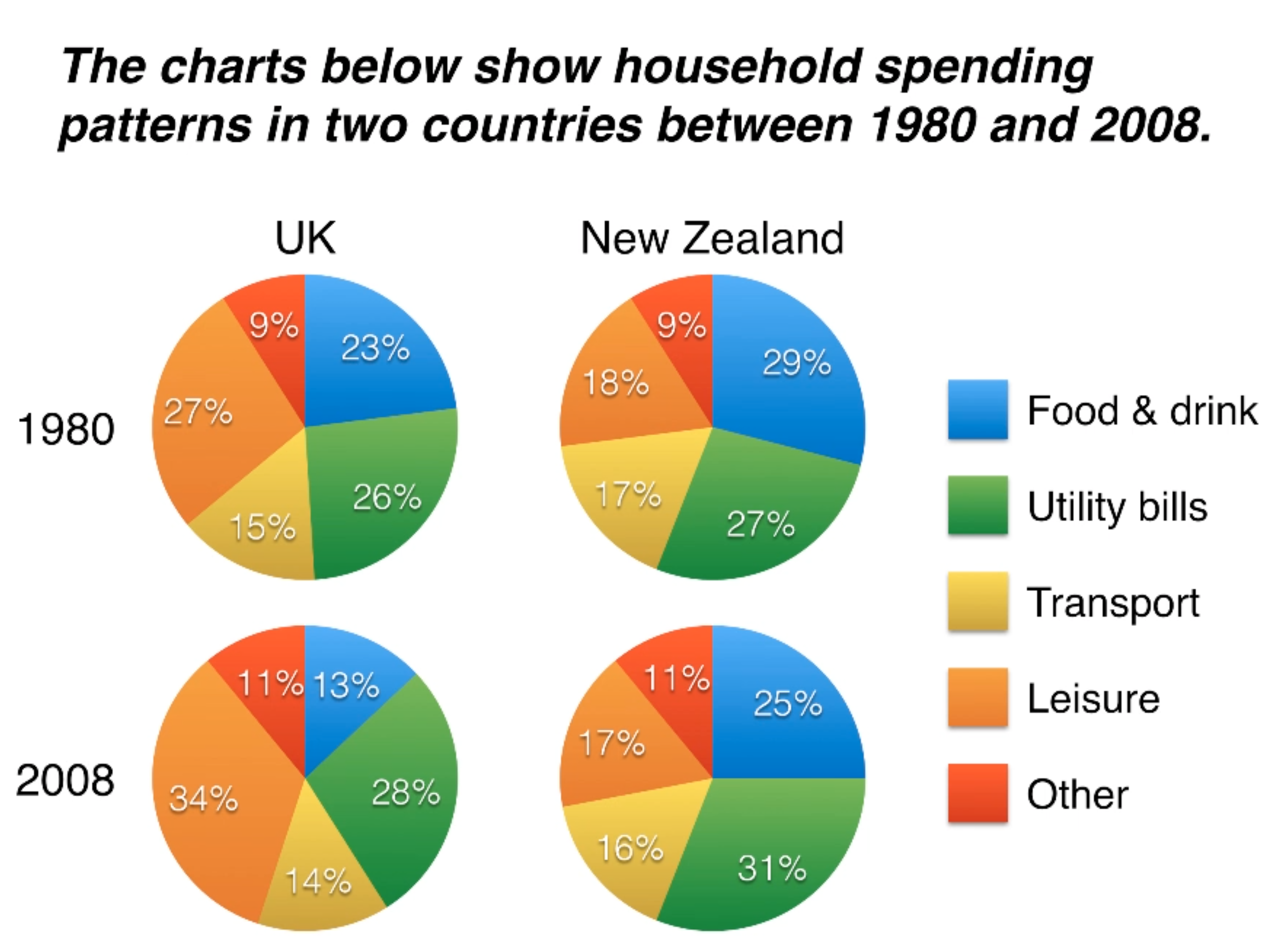
The charts below show household spending patterns in two countries between 1980 and 2008.
Practice:
The pie charts compare five kinds of household expenses between UK and New Zealand in 1980 and 2008 respectively.
Template:
The pie charts compare five categories of household expenditure in the UK and New Zealand in the years 1980 and 2008.
Overview: 2 sentences and 2 main points
both countries similar tendency
biggest difference
Practice:
It is noticeable that both countries saw declining spending on food and drink and saw slightly rises on utility bills from 1980 to 2008. Leisure costs were always the main part of household spending in UK, whereas the percentages of leisure spending in New Zealand were low in these two years.
Template:
It is noticeable that the proportion of spending on food and drink fell in both countries over the 28-year period, while spending on utility bills rose. Also, UK residents spent a significantly larger percentage of their household budgets on leisure than their New Zealand counterparts.
Review:
It is noticeable that the proportion of spending on food and drink fell in both countries over the 28-year period, while spending on utility bills rose. Also, UK residents spent a significantly larger percentage of their household budgets on leisure than their New Zealand counterparts.
Details in P3: same information as the overview, but details with numbers
In 1980, 29% of an average New Zealand household budget went on food and drink, while the equivalant figure for UK home was 23%. By 2008, expenditure on food and drink had fallen by 4% in New Zealand, and by a full 10% in the UK. By contrast, both countries saw an increase in expenditure on utility bills for the average home, from 27% to 31% in New Zealand and from 26% to 28% in the UK.
Details in P4:
Practice:
The proportion of spending on Leisure saw a significant rise from 27% to 34% over the 28-year period, whereas the equivalant figure for New Zealand residents only declined 1%. The household budget on transport and other categories in UK home and New Zealand home remained relatively stable between 1980 and 2008.
Template:
Leisure activities accounted for the highest proportion of UK household spending in both years, but only the third highest proportion in New Zealand. In fact, in 2008, Nea Zealanders spent on half as much in relative terms on recreation (17%) as UK residents (34%). In both countries, transport costs and other costs took roughly 15% and 10% of household budgets respectively.
Review:
Leisure activities accounted for the highest proportion of UK household expenditure in both years, but only the third highest proportion in New Zealand. In fact, in 2008, New Zealanders spent on half as much in relative terms on recreation (17%) as UK residents (34%). In both countries, transport costs and other costs took roughly 15% and 10% of household budgets respectively.
Tips:
- Don’t describe each country separately
- Don’t describe each year separately
- Compare countries and years together
- Mention all 5 categories
- Divide the categories into two groups for the two “detail” paragraphs
- The category “Other” is not important
- Don’t write “Leisure was 34%”
- Write “Households spent 34% of their money on leisure”
Vocabulary:
- spending, expenditure, spent, costs
- proportion of spending
- percentage of household budget
- the equivalant figure for a UK home
- fell, rose, saw an increase in
- by 2008, expenditure had fallen
- in 2008, expenditure fell
- spent a significantly larger percentage
- than their New Zealand counterparts (same groups people)
- 29% of an average household budget went on (goes on sth)
- while, by contrast
- leisure accounted for the highest proportion
- spent half as much in relative terms (only percentage, so use relative)
- recreation, leisure